

Almost half of B2B pricing pages show no tier structure at all. Of those that do, the tier the page pushes hardest is a marketing choice, not a recommendation.
We pulled the tiers off 286 live B2B pricing pages in October, for the pricing-tier study. We were looking for three things: the names vendors reuse, how often one plan is highlighted, and which billing models run a free plan.
The first finding is the one most pricing reviews skip. Almost half the pages we captured show no tier structure whatsoever.
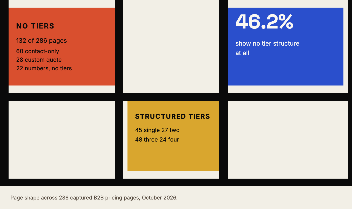
Here is the page shape across the sample. 132 of the 286 pages, or 46.2%, show no tiers at all.
Almost half. Another 45 show a single tier, 27 show two, 48 show three and 24 show four.
Roughly half the market, then, publishes a price or a call to action with no structure around it.
A buyer reading one unnamed number gets a figure and no way to reason about it. They cannot tell which of your plans is meant for a team their size, and they cannot tell what changes as they grow.
That is the first problem. The rest of this piece covers what happens when a page does have structure.
The mostly-missing structure
Of the 132 pages with no tiers, the largest group is contact-only sales pages, at 60. Custom-quote flat pages account for 28. Pages that show numbers without any tier arrangement account for 22.
The pattern says something about the market. Many vendors treat a tier as a commitment they would rather not make in public, so the page offers a route to a conversation instead.
That can be a rational decision. It also means the buyer enters the conversation without any shape to compare against, which makes the first call longer and the second call harder.
If you sit in the contact-only group, the honest move is to publish the tier names and the one thing each tier is for, even when the price stays private.
A buyer can then decide whether the conversation is worth having.
Naming is close to solved
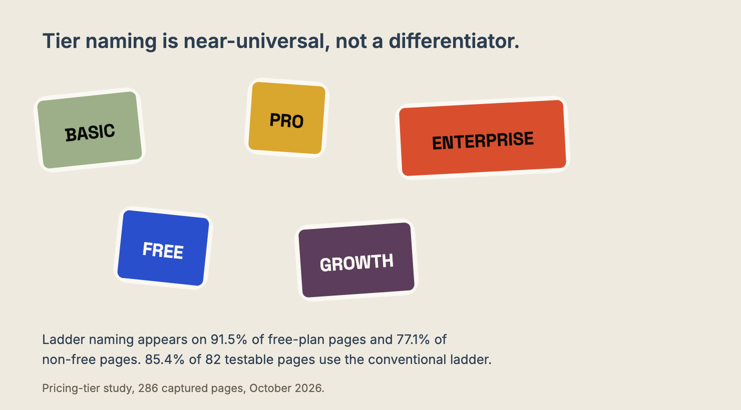
Among pages that do have tiers, the names are close to a standard. Ladder naming, meaning three or more ascending levels, appears on 91.5% of free-plan pages and 77.1% of non-free pages.
It is the default wherever tiers exist. Across the 82 pages we could test, 85.4% use the conventional ladder, so Basic, Pro and Enterprise are table stakes rather than a differentiator.
That is worth knowing before a naming workshop. Renaming your tiers to something more distinctive is a positioning move, not a clarity move. Choose the name for what the buyer will recognise, and spend the effort on what each tier includes.
The enterprise tier is where the page gives up
Fifty-one pages name an Enterprise tier explicitly. That is 46.8% of the structured pages in the sample.
Almost half of the vendors with tiers have decided they need a column called Enterprise. Far fewer have decided what to put in it.
In practice that column usually reads "Contact us", which makes it a dead end rather than a tier. The buyer who needs it is the buyer with the most money and the least patience for a discovery call, and the page hands them a form.
This is the same problem as the missing tier, one level up. A page saying "Enterprise, contact us" has told the buyer two things: there is a plan for you, and everything about it is unknown.
Price, minimum commitment, what is included, whether their requirement is even supported.
Here is what I would put there instead. The three or four things that change between the top published tier and Enterprise, named plainly.
Whether the price moves with seats, usage or a platform fee. Whether there is a minimum term. What the buyer has to bring, such as a security review or a named administrator.
None of that requires publishing a number. It requires saying what the tier is for, which is the same job every other tier on the page is doing.
The one thing to avoid is the reverse: an Enterprise column with a made-up floor price that nobody at your company will honour.
A published number that surprises everyone on the call is worse than a plain "talk to us", because it costs you the trust the rest of the page earned.
The spotlight is marketing, not advice
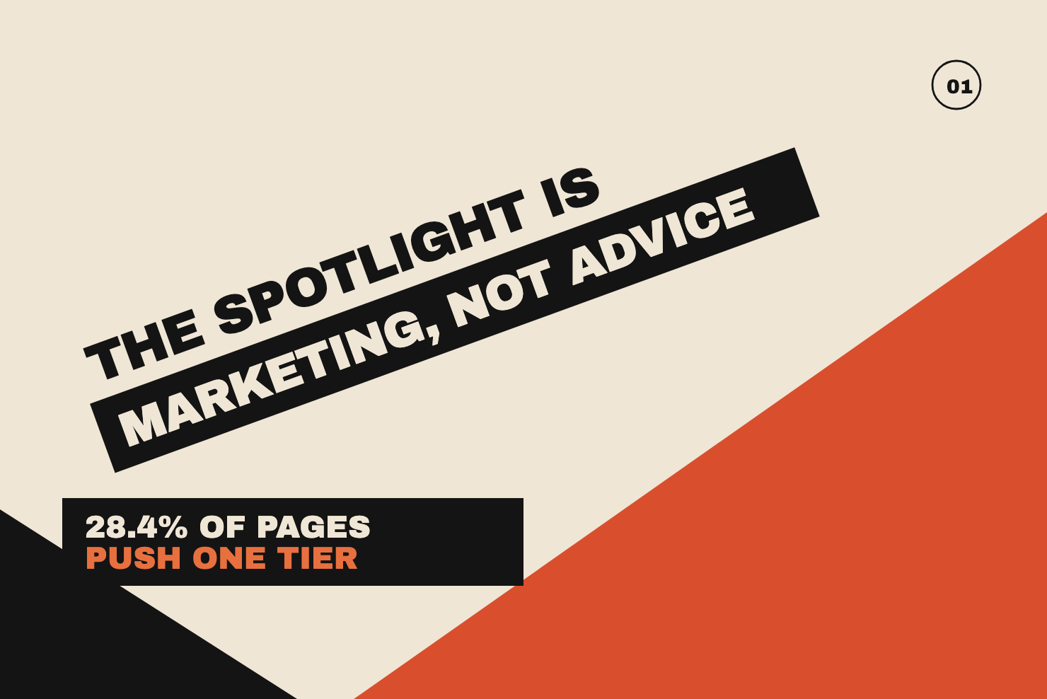
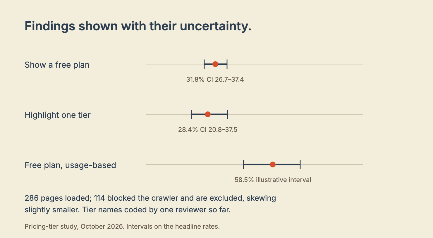
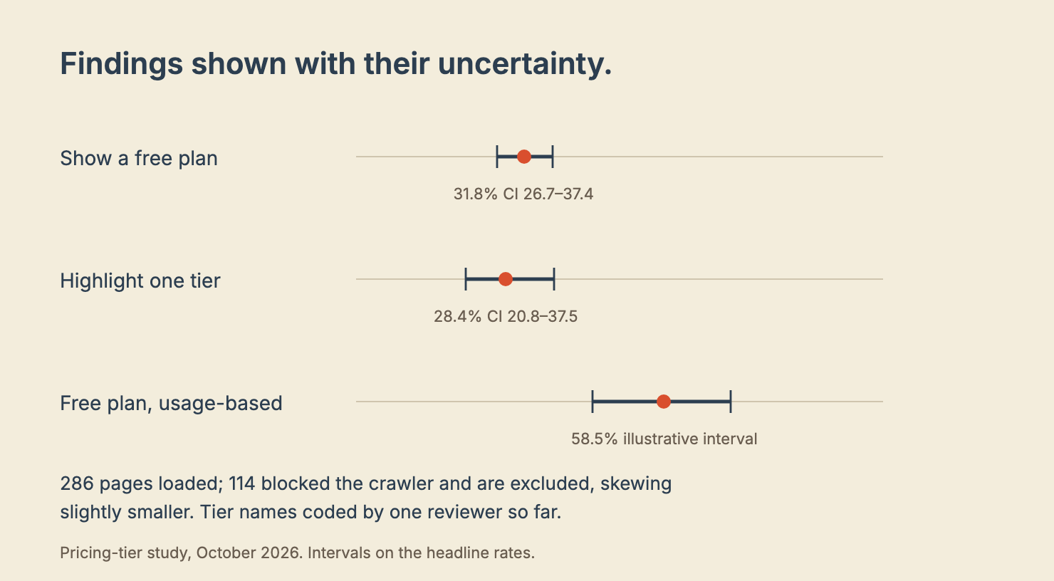
Here is the number to take into a pricing review. 28.4% of pages visually highlight one tier.
A buyer who has been steered toward a tier by the page's own design has not been given a recommendation. They have been shown where the vendor wants them to look.
I do not think this is usually cynical. It is what happens when a page is designed to serve two audiences at once: the buyer who wants to compare, and the funnel that wants one plan. The highlight is the funnel winning quietly.
The rate varies by billing model. Among structured pages, per-seat vendors highlight a tier 39.3% of the time. Usage-based vendors run at 28.0%, flat or tiered vendors at 24.3%, and contact-only vendors at 17.6%.
Per-seat vendors spotlight nearly twice as often as contact-only vendors. That fits the logic of a self-serve funnel. A per-seat page moves a visitor toward one plan. A contact-only page moves them toward a conversation.
Whichever model you use, the spotlight is a choice. Make it on purpose.
If the tier you spotlight is the one you most want to sell, say so in the copy. A buyer will work it out in any case.
Free plans follow the billing model
Across the 286 pages, 31.8% show a free plan and 17.1% show a free trial with no free plan.
No tier at all on the rest.
By company size, the rate rises gently: 23.4% at 1-10 employees, 31.9% at 11-50, 36.2% at 51-200 and 40.9% at 200+. That is a slope, not a ladder. It mostly reflects how many products a larger company has to gate.
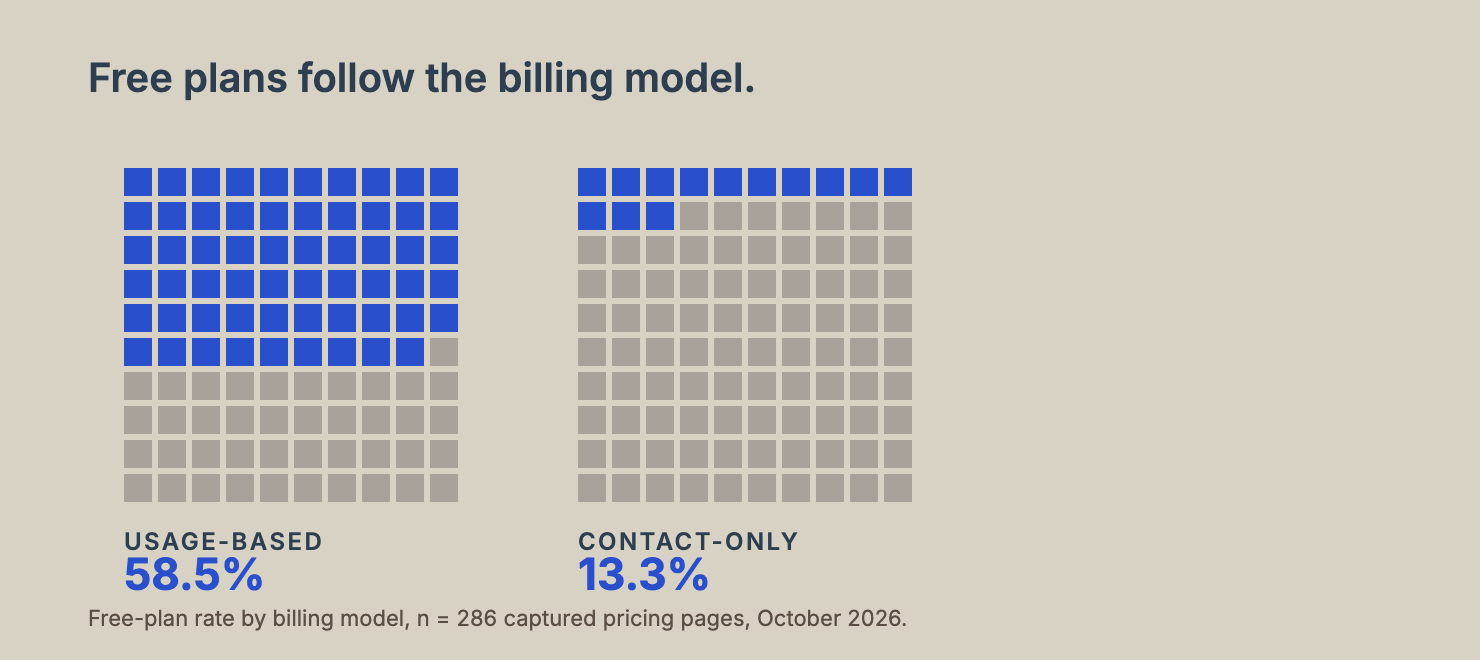
By billing model, the difference is much sharper. Matched against our pricing-transparency study of the same companies, 58.5% of usage-based vendors show a free plan, against 13.3% of contact-only vendors.
A free plan is a function of how you charge, not of how big you are. Usage-based products can offer a free tier at low marginal cost. Contact-only products usually cannot.
A buyer can see that difference. They will read a missing free plan on a usage-based product as a gap, and they will read one on a contact-only product as a deliberate choice, because in both cases it is.
The lesson for a pricing review is not to add a free tier. It is to check whether yours is doing the job your billing model implies it should.
The gate you choose decides the first conversation
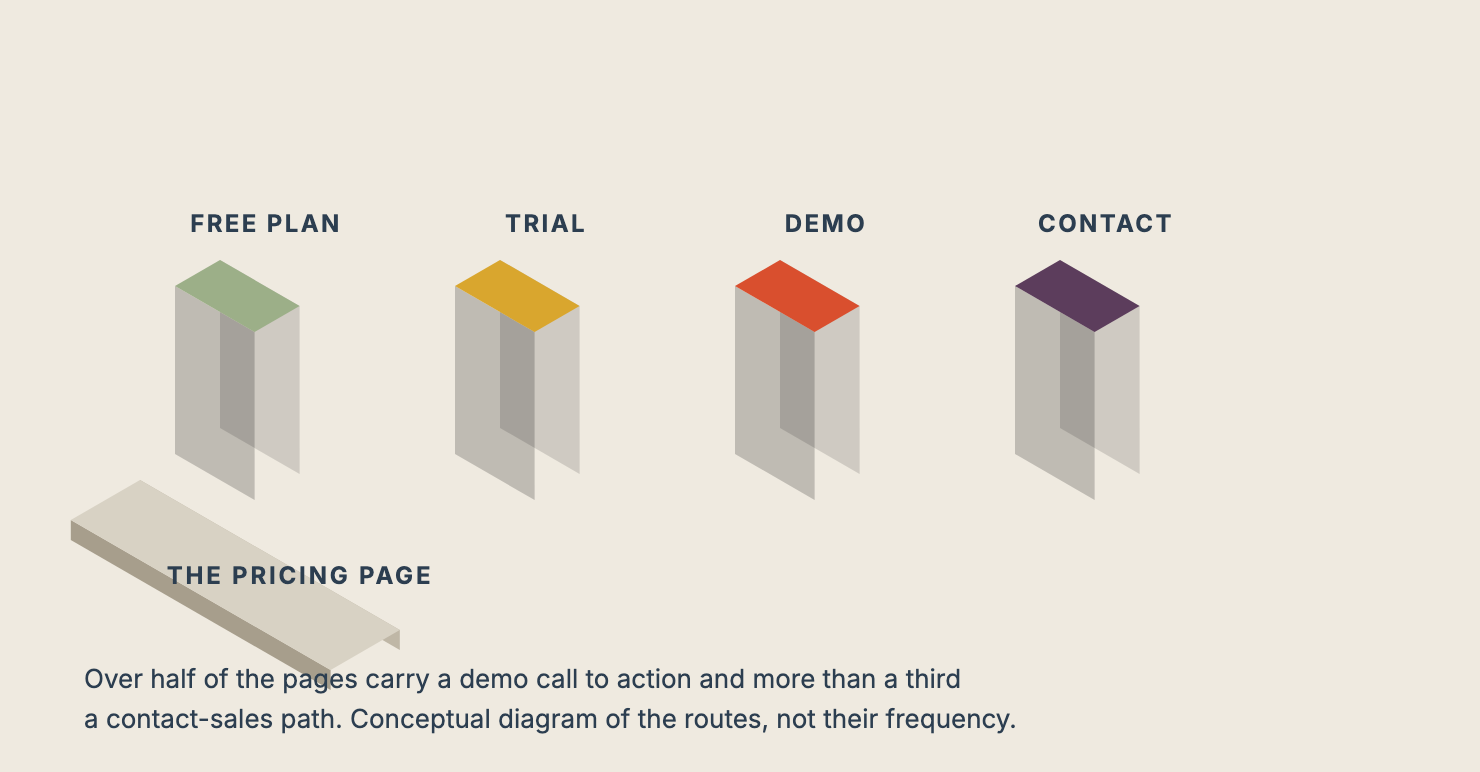
A pricing page can convert a visitor four ways: a free plan, a free trial with no free plan, a demo call to action, or a contact-sales path. Most pages combine more than one.
Over half the pages carry a demo call to action, and more than a third carry a contact-sales path. Those are the routes most likely to end in a meeting rather than a purchase.
That is not a failing. It is a deliberate choice about who your pricing page is for. The problem comes when the page offers the meeting route and the buyer was hoping to self-serve, or the reverse.
Decide which buyer the page serves first, then choose the gate that fits. Then check that the page does not send a self-serve buyer to a sales form, or a sales-led buyer to a checkout they cannot use.
Who this is for
*Pricing and product marketing teams.* The tier page is a product decision wearing a design costume. If you cannot say in one sentence what each tier is for, and who should not buy it, the page cannot either.
The straightforward version: nine sections of data, one afternoon of decisions.
*Founders without a pricing owner.* Start with the two questions the data answers. Do you charge per seat or by usage, and does your category publish a price at all? Those two answers determine most of the page, and neither requires a consultant.
*Buyers.* Read the highlight, not just the price. The tier a page pushes is a business decision about the vendor's own mix, and it tells you which customer they want more. Cross-check the free plan against the billing model before concluding a vendor is stingy.
*Researchers.* The catalogue of page shape is the finding worth replicating on another cohort. The spotlight and free-plan rates carry wide confidence intervals, so build a bigger sample before treating the between-group differences as settled.
How confident we are
A few limits belong beside the headline numbers.
The sample is 286 pages. We could not load 114 of the 479 pricing pages in the study, because they blocked our crawler. We excluded them rather than work around the block.
Those excluded companies skew slightly larger. Thirteen percent sit at 200+ staff against 7% of the included group, so the findings lean toward the smaller end of the market.
Tier names and highlights were coded by one reviewer so far, so the counts are descriptive. The confidence intervals on the spotlight and free-plan rates are wide enough that small differences between groups should not be read as settled.
Nothing here says what any tier should cost, or whether a given structure converts. It describes how the sampled pages are built, and nothing more.
Wrap-up
A pricing page does three jobs. It shows the buyer a shape, it signals which tier matters, and it tells the buyer which door to walk through. Most pages do the first poorly, the second on autopilot, and the third without deciding.
The fix is not a redesign. It is a short review. Does the page show a shape? Is the spotlight a deliberate choice? Does the free plan match the billing model? Are the gates pointing at the right buyer?
And one that the data says almost half the market fails: does the Enterprise column say anything at all?
If you can answer those in writing, your pricing page is doing its job. If you cannot, the buyer is answering them for you, usually by leaving.
Want to check your own pricing page against those questions?
Take the page a prospect reads before they ask for a call and scan it for the friction that stops them choosing.