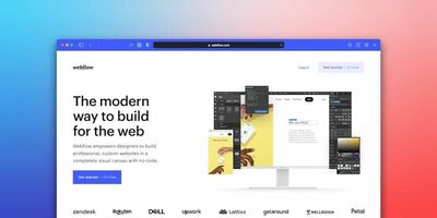
Hero sections are the most significant parts of a landing page because they're the first thing people see.
Your hero section is the first thing people see when they visit your website. It's where you establish a connection, whether it's to make a sale, get them to sign up for your blog, or just give you the benefit of the doubt so they read the rest of your website.
So how do you create a hero section that brings in customers and keeps them coming back? I'm going to show you how I build an engaging hero section every time.
A hero section should be designed in a way that makes your visitors click further into your website.
With the right hero section, you can quickly remove the friction that prevents visitors from clicking into your site and increase your conversion rates. Even though it’s one of the first things a visitor will see when they land on your website, it’s often not given enough attention and thought.
So here are some key tips to consider when creating an effective hero section:
- Be clear about what you’re offering.
Your hero section should complement your website navigation and support user journeys within your site by making it easy for them to find what they need quickly. Make sure that you’re clear about what you’re offering in this area of your homepage so that users immediately know if this is the right place for them or not.
- Give a reason to click into the page (and make sure you have clickable elements!).
It may sound obvious, but essential components like CTAs are often missing or hard to identify within a hero section because they blend in with other elements around them or simply don’t stand out enough against their background color (or lack thereof).
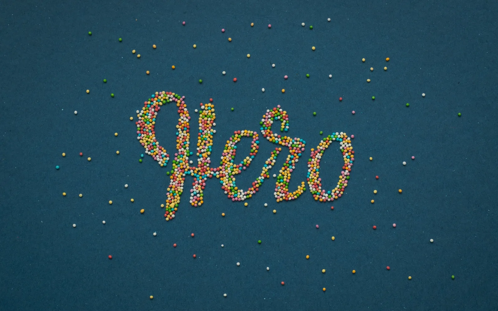
Use a high-quality image or video.
- Use an image or video. A hero section is an ideal place to feature the best images and videos you have of your product or service. Rather than just text, a high-quality, relevant image or video can draw a visitor in and make them want to learn more.
- If you're not sure where to get good stock photos, try Unsplash or Pexels. VideoHub and Coverr are great places for stock video content (and it's generally easier to find free high-quality images than free high-quality video—it's usually worth it to pay for video). If you're planning on uploading a short, engaging looping GIF file instead of a full-length video, Giphy is the way to go.
- There are several places you can host your videos online: Vimeo is one option; if you have a YouTube account, that will work too; and Wistia is yet another choice for both hosting and optimizing your videos for the web. Lastly, Spotlightr stands out as an excellent choice for secure and private video hosting.
Write a headline that captures your attention and shows your value.
For every reader, there comes a time when you need to create an engaging hero section that encapsulates what your site is all about. Although the hero section on a website doesn't have to be as big and in-your-face as the one in a paper issue of Marvel Comics (although that would be pretty cool), it plays a huge role in capturing people's attention.
Creating an engaging hero section isn't different from creating another part of your website. You need to ask yourself, "What is my site's message?" If it doesn't contain the value, there's no reason for people to read it. However, if your site presents value—with useful content that helps others—people will be more likely to engage with your content and become fans.
Use descriptive subheadings to expand on the headline.
Next, use descriptive subheadings to expand on the headline and draw in your audience.
If you’ve created an attention-grabbing headline, your website visitors will want more details immediately. And that’s where a subheading comes in handy. Use it to provide additional context and instantly explain what makes your service or product unique.
The exact function of the subheading depends on your business and industry, but there are a few best practices to follow:
- Use the headline as a hook, and the subhead as an explanation of its value for potential customers
- Highlight key benefits that customers can expect from using your product or service
Add calls to action.
Calls to action should:
- Be in a button format. This is important because buttons make it clear to the reader that they need to click. A phrase like “Learn more” or “Download now” is much more effective when placed in an actual button as opposed to plain text.
- Be action-oriented. Good CTA buttons are always about taking action, whether to sign up for a newsletter or buy a product. The best way to keep your visitor on your website is by drawing them in with the promise of further information or direct value, which you can do by writing CTA copy that encourages them to take another step forward in your conversion funnel (the steps users follow along the way from becoming aware of your brand/offerings to actually making a purchase).
- Be above the fold. This means putting CTAs at the top of your page where readers will see them right away without having to scroll through anything else first—this location increases their visibility and makes it easier for visitors who aren't sure if they want what's being offered yet (maybe they're not even sure what exactly “it” is!) but still want an opportunity before leaving altogether. Putting these links above all other content forces readers into making an informed decision much faster than necessary since most people don't have time or patience left after browsing around someplace new for too long without finding what they're looking for.
Make sure you have the right design for your hero section.
You want to make sure your hero section design doesn't clash with the rest of your website. A design that's too busy might distract users from the main message, while a design that's too plain and simple may not grab their attention. An easy way to avoid this is by using a color scheme consistent with your brand's overall look and feel.
Another element you should focus on is whitespace. If your hero section design is cluttered and has little or no whitespace, it will be hard for users to read it. You can use margins, padding, and line spacing to give your hero section some breathing room and make it easier for users to read it.
Hero sections make or break the first impression of your website.
Much like a hero in a movie, the hero section of your website makes or breaks the first impression. It is that first element that greets visitors who land on your site—and if it’s not engaging, they might just leave.
But you can use this to your advantage and make sure all eyes are on your content. What’s more, by using a hero section, you can increase engagement, improve UX and conversion rates, and be more informative without overwhelming visitors with too much text.
There’s no way around it: you are losing customers if you don’t have a hero section on your website. And if you do have one, use it to make people stay on your site and convert them into paying customers.