Background
In one of our previous posts, we talked about the core web vitals, their components, and multiple ways to measure each one of them. In the coming days, it's going to play a major role when Google overhauls its search algorithm. And if you do not want to get yourself too shocked with the search results, it's better to start fixing all the performance related issues your site might be having.
I am not going to cover what is cumulative layout shift in this post. You can read about CLS in this post below:

I am going to cover ways to fix the cumulative layout shift. But before that, let's see how does a CLS typically look like.
Cumulative Layout Shift example:
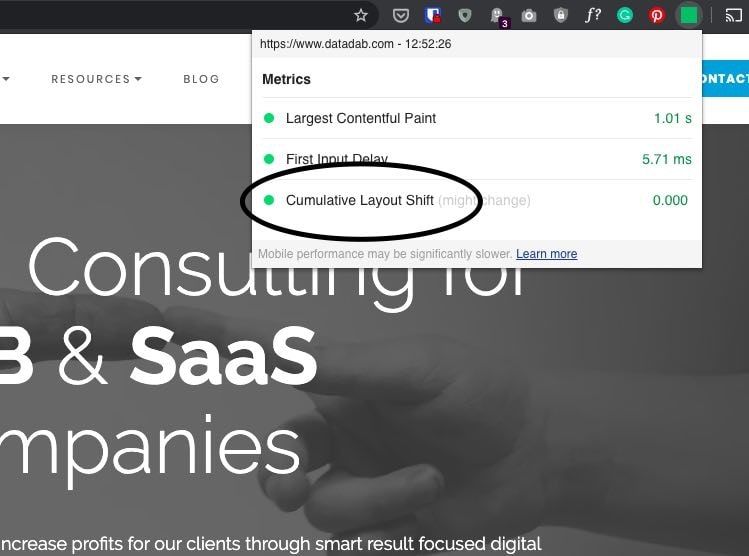
In the below image showing the home page of DataDab.com with its CLS status as 0, which is a good zero to have in this case. It means none of the website elements shift dramatically across the canvas.
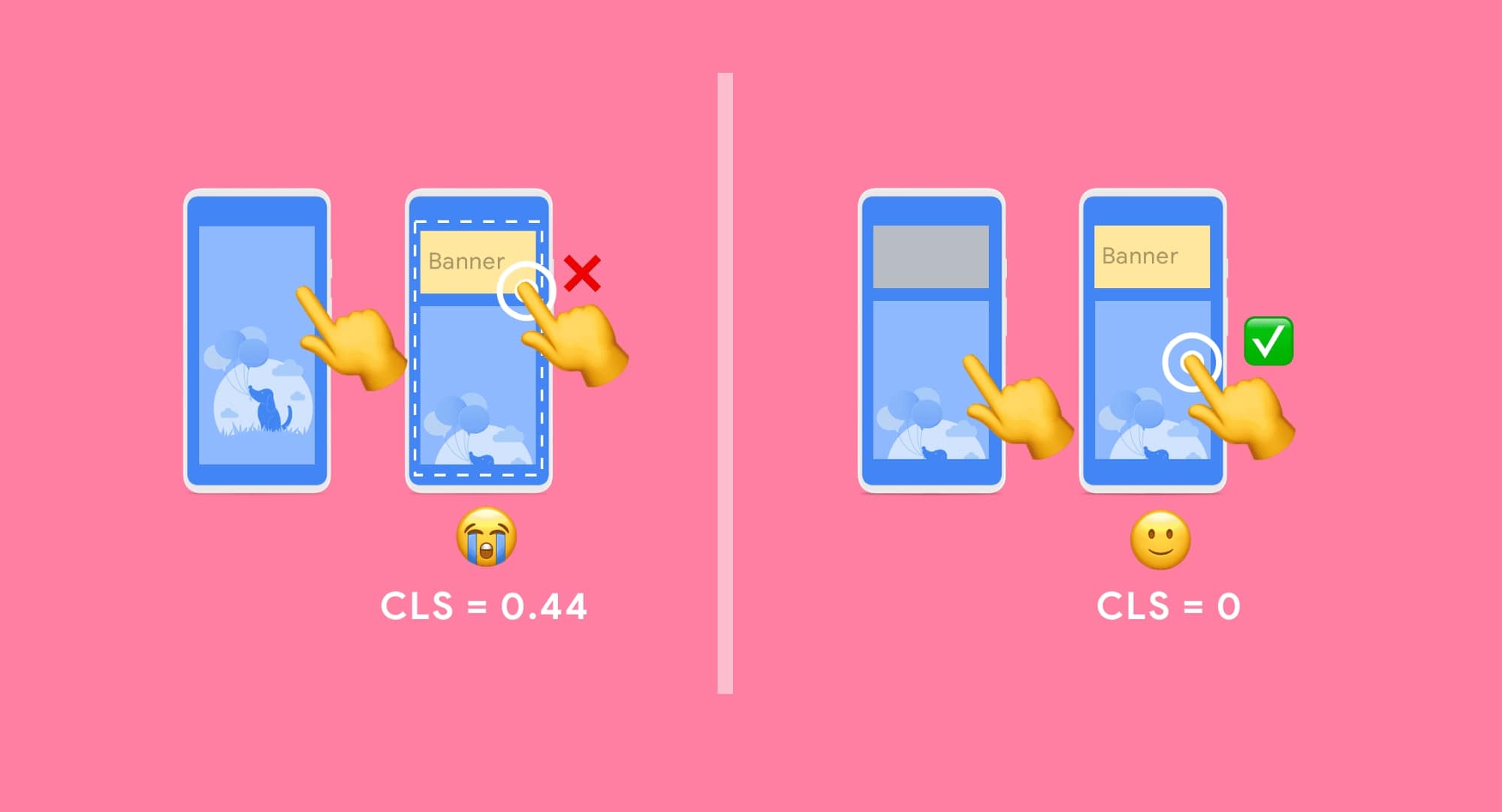
I am sure you'd have encountered CLS issues on many of your favorite sites that rely on ads for monetization. You wanted to click on the story's title but you end up clicking an ad inadvertently as a banner ad pushes the story down as soon as the page is done fully loading.
What causes CLS to happen in the first place?
Let's try to understand the reasons first:
- Using fonts improperly leading to flash of invisible text(FOIT) or flash of unstyled text(FOUT)
- Using images without specifying their dimensions
- Embeds and banner ads and iframes without dimensions
- Actions waiting for a response from the network before updating DOM
- Any content that is injected dynamically
Now that we know the reasons, let's try to deal with each of the reasons one by one.
How to diagnose what elements are causing CLS?
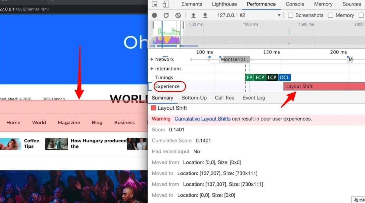
Performance panel in DevTools in Google Chrome illustrates layout changes in the Experience row. The Layout Shift Summary view contains the total layout shift score as well as a rectangle overlay showing the affected regions.
Ways to fix cumulative layout shift
Use font:display values with your custom fonts
All those fancy google fonts might be causing FOIT and FOUT and the chances are you wouldn't have thought it could lead to any problem.
If you are wondering, what's FOIT and FOUT, allow me to explain.
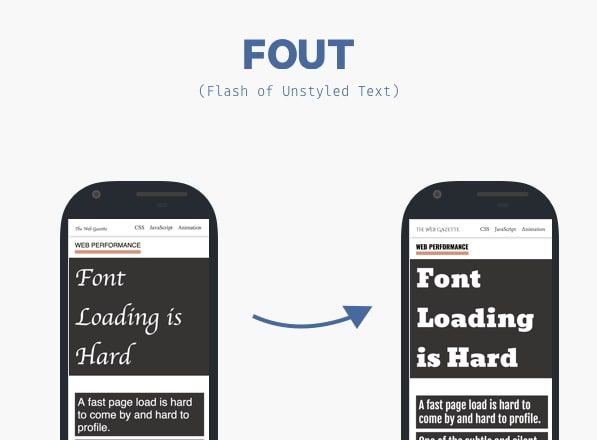
When a browser needs a font from a web server, any element that uses that font will be hidden until the font asset has been downloaded fully. This is known as FOIT or flash of invisible text.

Similarly, browsers display a fallback font in the font stack until the custom one loads. This creates a flash of unstyled text or commonly known as FOUT.
Lighthouse can be your friend here in identifying what exactly is the cause of CLS. If the fonts are culprit, there are some easy fixes to deal with them. You can simply use font:display values.
You can minimize these effects by using font:display values like auto, swap, block, fallback and optional.
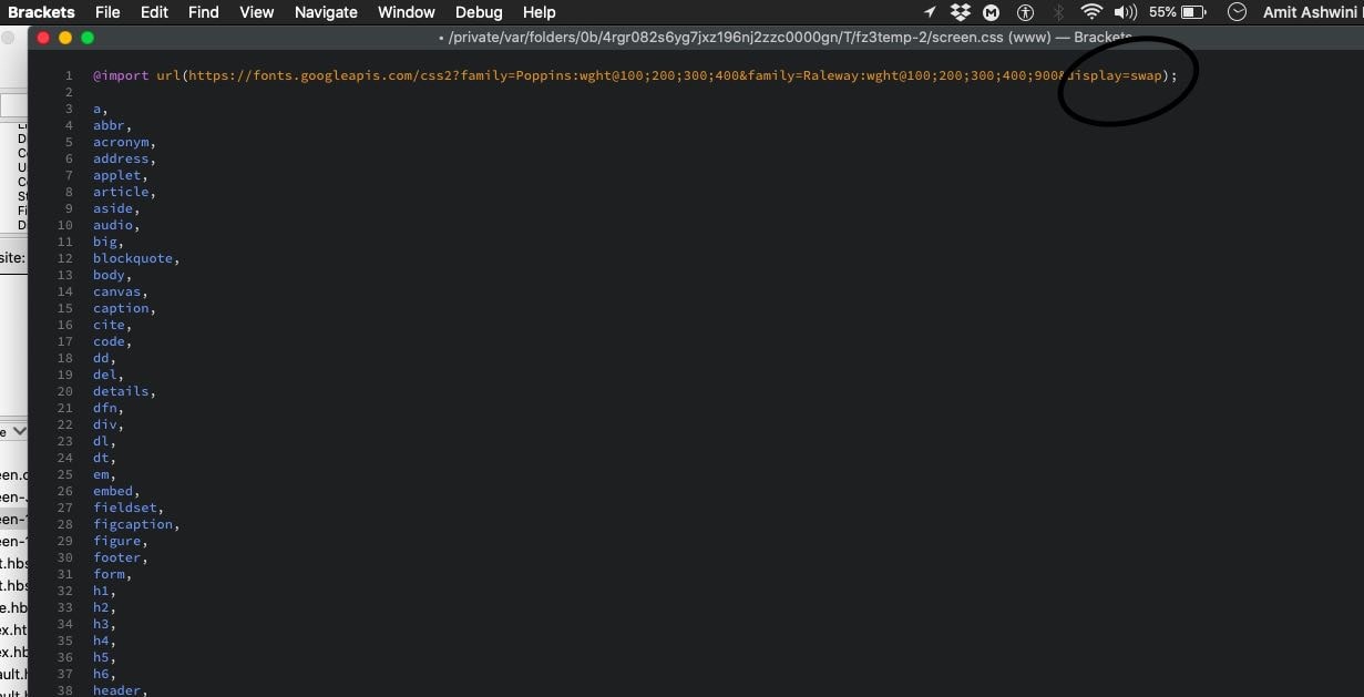
But if you want to be 100% sure there is no layout shift happening, you should use font:display in conjunction with link rel=preload like I have used here:
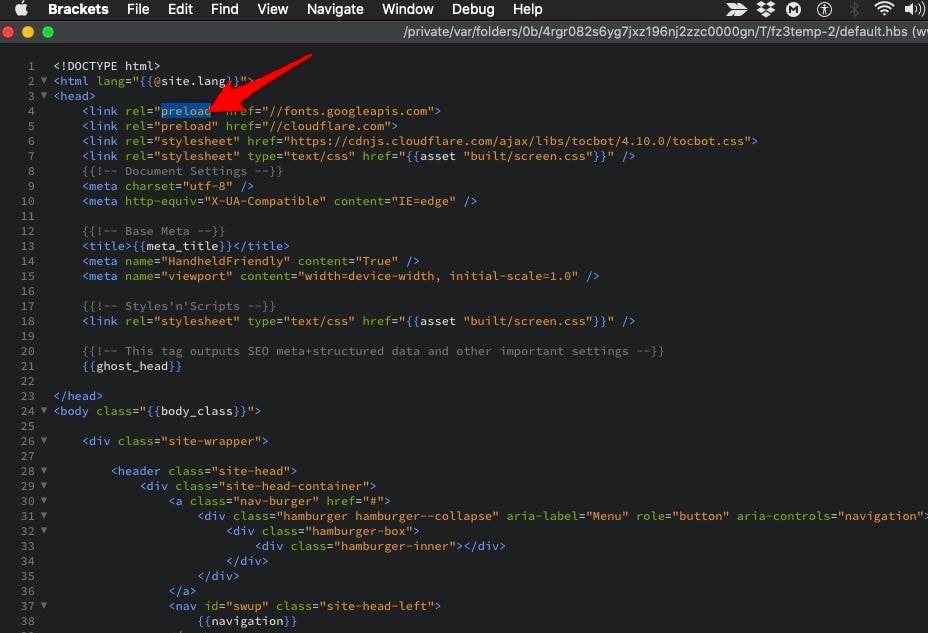
Include width and height attributes on image and video elements
Specifying height and width on images used to be a healthy old practice, but with the popularity of responsive web design, it got lost. This is how it should be:
< img src="datadab-home-page.jpg" width="1440" height="810" alt="DataDab Home Hero Image">
Modern web browsers now set the default aspect ratio of images based on the height width attributes of an image. So it's a good practice to set them to prevent layout shifts.
img { aspect-ratio: attr(width) / attr(height);}
This predicts an aspect ratio, on the basis of dimension attributes before loading the image. It provides that information at the very beginning of the calculation of the layout. The aspect ratio is used to measure the height as soon as an image is told to be a certain width.
When dealing with responsive images, srcset determines the photos that you let the browser choose between what sizes each image is. To set attributes of img width and height, each image should use the same aspect ratio.
< img width="1000" height="1000" src="dd-about-1000.jpg" srcset="dd-about-1000.jpg 1000w, dd-about-2000.jpg 2000w, dd-about-3000.jpg 3000w" alt="dd-about"/>
Setting dimensions on ads and embeds
Ads are among the biggest contributors to layout shifts. Publishers and ad networks often support dynamic ad sizes. Owing to higher click rates and more advertisements competing in the auction, ad sizes improve efficiency and hence revenue. Sadly, due to ads pushing visible content that you are viewing down the page, this can lead to suboptimal user experience.
You can try these steps to reduce the chances of high CLS because of ads:
- Reserve space statically for ad slot. That is to say, style the item before loading the ad tag library.
- When putting ads in the content flow, make sure the slot size is allocated to avoid shifts. If loaded off-screen, those ads will not trigger layout shifts.
- When putting non-sticky ads near the top of the viewport, take extra care.
- Avoid collapsing the allocated space if a placeholder shows no ad when the ad slot is available.
- Eliminate layout shifts by reserving the ad slot with the widest possible duration.
- Use historical data to choose the most likely size for the ad slot.
In the case of iframes and embeds, do note the dimensions and style of a placeholder correspondingly for the embed. Using media queries, you may need to account for subtle differences in ad/placeholder sizes between various form factors.
Statically style slot DOM elements passed into your tag library with the same sizes. This ensures while loading, the library doesn't cause layout changes. If not, the library might adjust the size of the slot element after page layout.
Improve HTTP response & elements synchronization
Slow server HTTP response may also cause issues with the content layout. When you are using a CDN, loading of the indented elements takes quite a few milliseconds. That causes the content to jump. You then need to either build a space in DOM or synchronize the load with other elements.
Properly handle dynamically injected content
Never inject content above existing content, except for user interaction. This ensures anticipation of any layout shifts that occur.
You'd have noticed layout shifts due to a UI that pops up at the top or bottom of the page when you're trying to load a site. Like an ad, this also happens with banners and forms that change much of the page 's layout.
When you choose to display these kinds of UI affordances, reserve enough space in the viewport for it in advance. Try to use a placeholder or skeleton UI so that once it loads, it does not trigger page content to move around unexpectedly.


