Whether you're creating an app for the first time or looking to update your existing app, writing high-converting copy is a must. It's a tried-and-true way to set yourself apart from the competition, and it can make all the difference when it comes to whether or not someone decides to download your app.
So how do you get started? Don't worry. We've got you covered. Here are seven tips for writing app copy that converts:

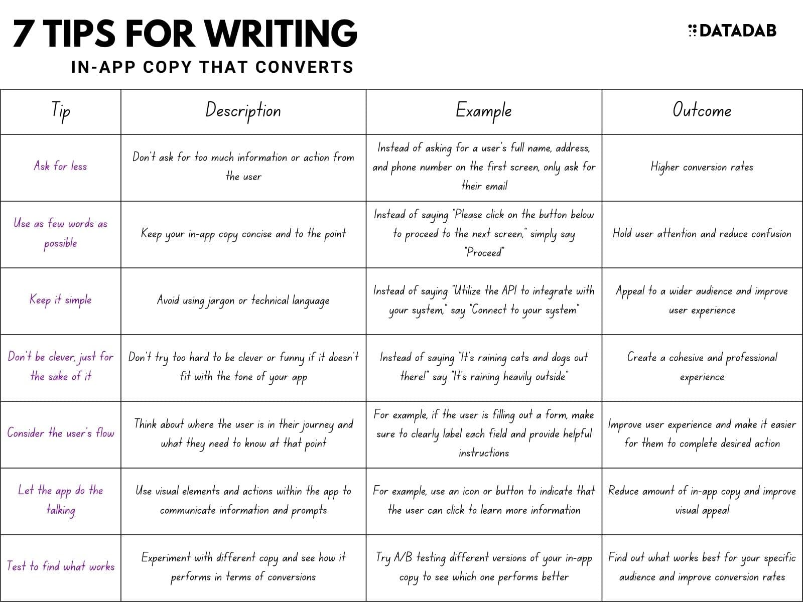
Ask for less.
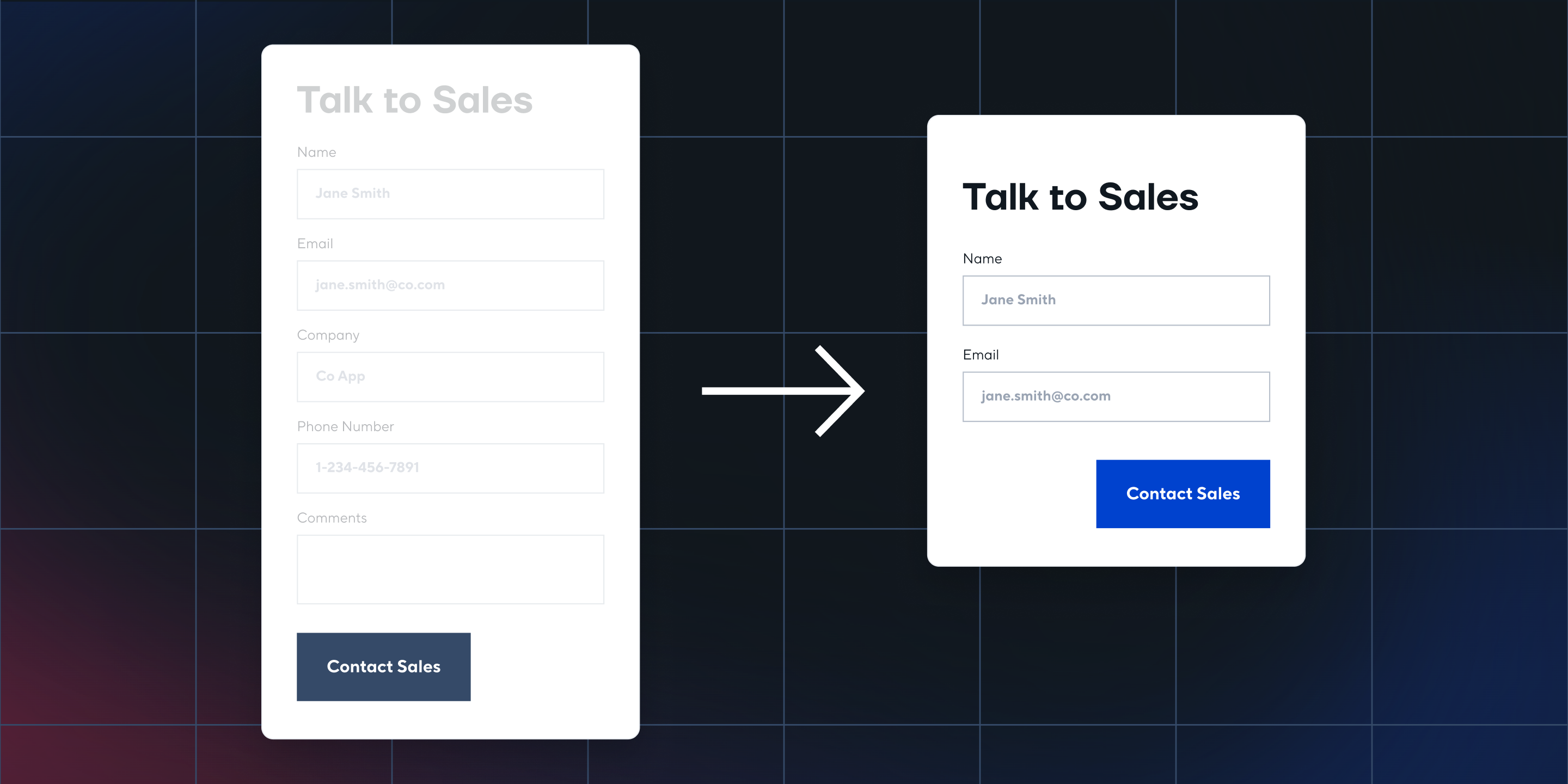
When it comes to forms, less is more. Think about the last time you began filling out a form and saw 20 fields staring back at you. I bet you experienced an all-too-familiar sensation of dread, maybe even one of your favorites: “Not this again.”

Research has shown that users are more likely to complete forms when fewer fields are on the page. Why? Because it takes less work for them to complete the task!
Practically speaking, though, what do shorter forms mean for your business? They mean conversions. The longer a user must commit to your form, the more likely they are to drop off before submission. As we fill out forms, our brain begins working overtime on complex tasks like remembering usernames and passwords or trying to come up with answers that sound believable. Too much work results in an abandonment rate that leaves you feeling like your checkout process has been taken out behind the woodshed and shot deader than disco (if you're old enough to remember disco).
Use as few words as possible.
There are simple ways to make your copy easier to read, and it all starts with being concise. You should always try to use as few words as possible. The same goes for your sentences and paragraphs. Try to keep each one short so that you don’t crowd the screen or lose readers’ focus.

When in doubt, favor shorter words over long ones. Longer words aren’t always necessary and can make your message confusing for users.
Finally, stick to the active voice instead of the passive voice wherever possible (e.g., “The cat ate the mouse,” rather than “The mouse was eaten by the cat”). It makes your writing more direct and will help get your point across faster!

Keep it simple.
- Use simple language. Anything that requires the user to think or interpret before understanding will reduce your conversion rate. You need to make all information as straightforward as possible.
- Use short sentences. Sentence length is vital for clarity and understanding; long sentences are difficult to read and harder to understand than short ones.
- Use short words. Generally speaking, shorter words are more easily understood than longer ones, so use shorter versions of words wherever possible – "use" instead of "utilize," for example, or "buy" instead of "acquire."
- Use short paragraphs. Short paragraphs are easier to understand than long ones and make a page seem less dense and intimidating – but only up to a point! If a section is too short, it can feel disjointed and incoherent. The ideal paragraph length is between three and six sentences; four seems about right in most cases (of course, there are always exceptions).
- Use appropriate contractions: 'don't' instead of 'do not,' for example (and the same goes for negatives in general – just don't overdo it). Contractions help relieve some of the stiffness from your writing without affecting clarity or meaning; they also help keep sentence lengths down (see above).
- Keep grammar simple by avoiding complex constructions such as relative clauses: "The book that I bought yesterday didn't contain any useful information" is better written like this: "I bought the book yesterday, but it didn't contain any useful information." This makes it easier for readers to follow your train of thought and keeps them engaged with what you're saying rather than being distracted by convoluted syntax (which can happen even if you've got perfect grammar!).
Don't be clever.
Don’t get clever with words just to be clever. Your users aren't concerned with your wordplay. If a user doesn’t understand what you’re saying, they’ll simply leave.
When writing copy for your app, be clear and straightforward – don't waste time by using overly complicated or confusing language. This is the lesson behind PayPal's "send money" button: Keeping it simple and focusing on function made sending money online very easy to do.
Tinder is an example of functional simplicity in action. It does away with unnecessary complications like bios and profile pictures. Instead, it focuses on users' needs first – swipe right for yes, left for no – making it incredibly easy to use. The result was that Tinder became one of the fastest-growing social apps in history.

Consider the user's flow.
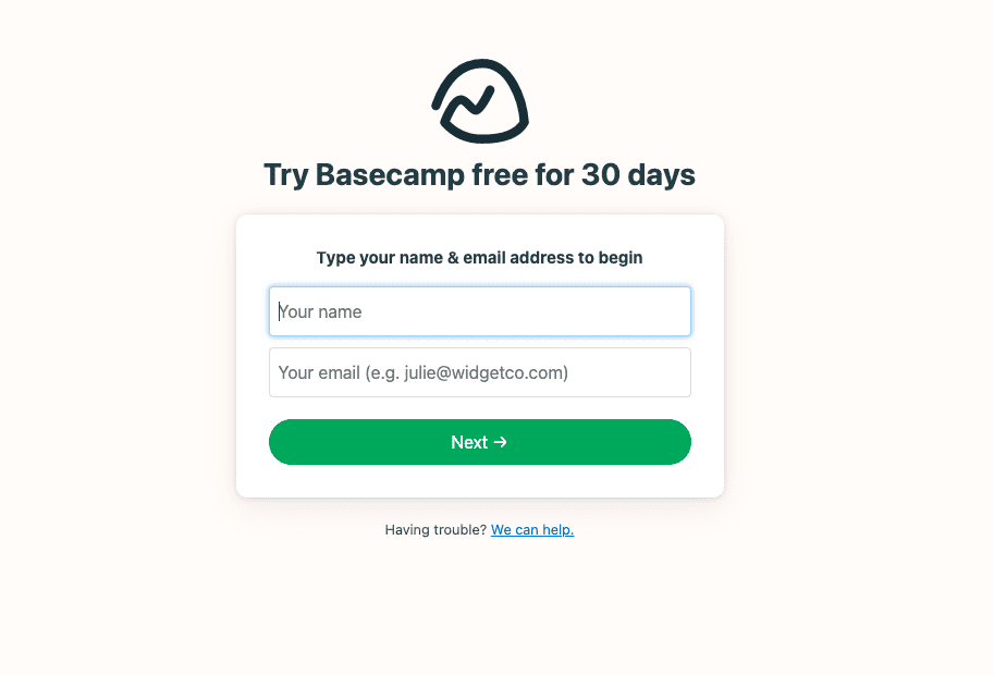
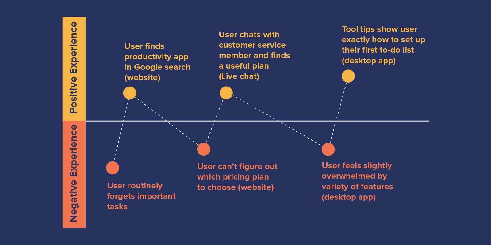
As you write your app copy, be mindful of the process that users will go through. Please don’t ask for information before you need it, and don’t ask for information that you don’t need. Ask for information in a sensible order and allow the user to complete the process in as few steps as possible. This improves user experience and reduces drop-off.
The most crucial point here is to consider the user flow at each stage of the process. Suppose they have to scroll back up or take any other extraneous steps because of an oversight on your part. In that case, you risk losing them entirely, so minimize friction and make sure all buttons are clearly labeled with concise text that tells users what will happen when they click them.
Let the app do the talking.
You want to let your app do the talking. The next best thing to a one-on-one demo is showing your users how they can use the app themselves. By showing them—instead of telling them—how your app works, you'll help them visualize how it could be helpful to them.
Show examples of what a user would experience if they were using the app right now. Include screenshots or images showing the user interface and how a user would interact with it and photos or videos of people actually using the app. You can also include visualizations of benefits unique to your app but don't yet exist in other apps' copy.
Test to find what works.
The only way you’ll know what kind of copy converts for your product, and your audience is to test it out. Not sure where to start? It’s as simple as writing a few variations for a screen, putting a couple of best versions in front of 10 people, and seeing which one sticks with them. The more you test different options, the more you’ll learn about your audience and the words that convert them into users.
Once you decide on a couple of solid options, try testing out two other elements: design and full-funnel process. Design can significantly impact how users perceive your app or site (and think of its content), so make sure you get it right or make adjustments based on feedback. Full-funnel processes are also critical because they show how the copy interacts with other elements on the page (how signup buttons are laid out; whether forms are long or short). Also, consider testing across channels—what works for an in-app screen may not work for an email newsletter or ad!
Keeping things simple and streamlined will give you the best chance of converting your users into customers.
With such a small screen and limited time to get peoples' attention, the user mustn't be forced to read more than necessary. While you may feel strongly about the fabulous features of your app, think of how much more impactful they will be when they're demonstrated rather than explained. Keeping things simple and streamlined will give you the best chance of converting your users into customers.
To sum it up:
- Don't make it about you. The first step to writing a good copy is taking yourself out of it; think about what benefits the user gets from your app or service instead of how great it is. Put yourself in their shoes and try to find their pain points; address those directly in your text.
- Keep things short and sweet. Your users aren't reading GRRM novels on their phones, so keep things short and straightforward.
- Avoid being clever or overly creative with words; this will just confuse people.
- Ask for less information whenever possible so that there's no barrier between them trying out your product (and hopefully buying)


