Your website's messaging makes or breaks your ability to attract, engage, and convert visitors. Yet, many businesses unknowingly commit common messaging mistakes that push visitors away instead of pulling them in.

After analyzing hundreds of websites across industries, I've witnessed these messaging mistakes over and over again. In this post, I'll break down the top 10 you need to avoid—along with examples and solutions—so you can create messaging that captivates instead of repels.

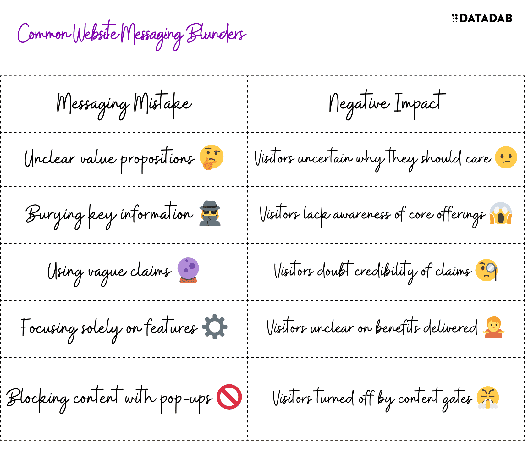
1. Using Unclear Value Propositions
Your homepage hero needs a crystal clear value proposition answering: What do you offer, and why should I care?
Bad Example:
"ABC provides innovative solutions to help companies succeed in a dynamic world."
This tells visitors nothing about what you actually do or why it matters.
Good Example:
"ABC AI recruiting software fills your open roles 2x faster with top talent."
This clearly communicates what you deliver and key benefits.
Key Takeaways
- Clearly explain what you offer
- Communicate concrete benefits
2. Burying Key Information
Don’t make visitors hunt to uncover what your business provides. Key information should be visible above-the-fold so visitors immediately understand your core offerings.
Bad Example:
Most content focuses on company values and achievements while sparse details are provided about actual products or services.
Good Example:
Hero section has clear overview of offerings alongside a product catalog linked in main nav. Key details are provided upfront rather than deeply nested.
Key Takeaways
- Feature core offerings prominently
- Link to sections with more details
- Prioritize key information visitors need

3. Using Vague Claims
You only have seconds to hook visitors before they disengage. Vague, hyperbolic claims fail to impress or inform.
Bad Example:
"Our technology is the most advanced in the industry for driving amazing outcomes."
This tells visitors nothing substantial or believable.
Good Example:
"Our deep neural networks have 20% higher precision than competitors for detecting credit card fraud."
This provides concrete, quantified information on competitive differences.
Key Takeaways
- Avoid vague adjectives like “best” or “most advanced” without evidence
- Use specific data points and metrics when possible
- Provide context comparing capabilities to alternatives
4. Focusing Solely On Features
Many businesses obsess over features without communicating benefits. But visitors don’t care about features—they care about how you’ll solve their problems.
Bad Example:
”Our lending software includes customizable data dashboards, analytics builder, native app integration...”
This highlights capabilities without relevance to visitors.
Good Example:
”Streamline the lending process with custom analytics revealing deeper borrower insights so you expedite high-quality loan approvals.”
This explains key features and meaningful benefits.
Key Takeaways
- Don’t just list features—explain how they benefit visitors
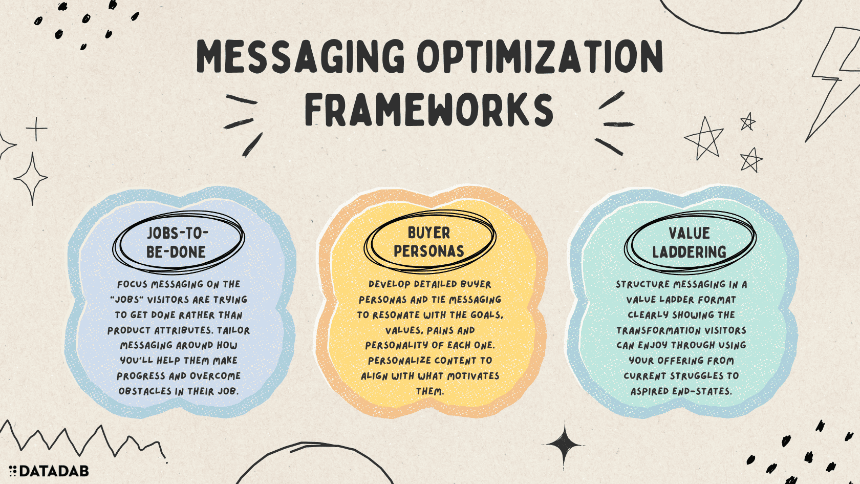
- Tie capabilities directly to target audience needs, pains, and jobs-to-be-done
- Translate tech/industry jargon into layman terms
5. Blocking Content With Pop-ups
Aggressive pop-ups demanding emails or asking visitors to log in before seeing info are off-putting. Don’t hide your content behind walls.
Bad Example:
Visitors cannot access blog articles without logging in or submitting their email first.
Good Example:
Blog content is freely available and sign up forms are less disruptively positioned on sidebars or page footers.
Key Takeaways
- Avoid gatekeeping content behind pop-ups or sign up walls
- Offer value before asking for visitor information

6. Only Talking About Yourself
Many businesses constantly brag “we are the best because...” This self-centered focus on “us” turns visitors off.
Bad Example:
”With over 20 years experience, we’re globally recognized leaders in our methodology for strategy consulting services that drive impressive results for our Fortune 500 Clients.”
Good Example:
”We partner you with proven strategy consultants to transform direction into tangible outcomes through achievable steps—helping position you for the next phase of success.”
This explains the partnership and results rather than boasting.
Key Takeaways
- Focus messaging on visitors—not yourself
- Visitors engage better when content resonates around their perspective
7. Using Overly Formal Tone
Stiff, formal messaging lulls visitors asleep. But conversational language makes engaging connections.
Bad Example:
”ABC's professionals avail their competencies by leveraging repeatable scientific techniques to yield solutions for maximizing client opportunities.” 🥱
Good Example:
”Our strategists tap into research discoveries plus their own experiences to customize proven tactics that seize openings tailored for you.” ✅
This sounds like helpful advice from a trusted advisor.
Key Takeaways
- Write conversationally, like you’re talking to a friend
- Avoid formal, dense paragraphs full of jargon
- Use relatable language

8. Inconsistent Messaging Across Pages
Mixed messages confuse visitors about what you’re offering. Ensuring alignment across sections prevents frustration.
Bad Example:
Homepage focuses on analytics dashboards while product page highlights ML recommendations. What’s the product actually for?
Good Example:
All pages reinforce the same core offerings and value proposition tailored to target buyer needs.
Key Takeaways
- Drive home consistent messaging on all pages
- Avoid confusing visitors with disjointed info
- Create cohesive visitor journeys linking value props to product details.

9. Failing To List Pricing Details
Visitors need pricing information to determine if your offering provides adequate value. Failing to indicate pricing wastes their time.
Bad Example:
No indication is given of pricing options or ranges. Visitors must submit contact inquiries just to get ballpark figures, even for listed services.
Good Example:
Pricing pages clearly list available tiers along with features. Bundled packages are explained or custom quotes offered.
Key Takeaways
- Transparent pricing builds trust
- Outline costs for core offerings
- Explain value delivered per price points
10. Difficult Website Navigation
If visitors struggle to find what they need, they’ll simply leave irritated. Ensure effortless navigation between pages containing key information.
Bad Example:
Cluttered menus have vague options like “Resources” linking to pages with multiple nested sub-sections overflowing information.
Good Example:
Simple main nav has specific functional labels linking to key pages like “Products,” “Pricing,” “Case Studies.” Footer supplementary links provide secondary pages.
Key Takeaways
- Organize clear IA and navigation focused on target visitor journeys
- Ensure calls-to-action and value props across pages direct visitors to take next steps
These are 10 critical pitfalls dragging down the effectiveness of your website messaging. By taking the appropriate remedial actions, you’ll better attract, engage, and convert more visitors moving forward.
FAQ
1. Why is a strong value proposition so vital on a website's homepage hero?
Your homepage hero banner has only seconds to capture a visitor's attention and interest before they disengage. An unclear value proposition fails to inform visitors why they should care or compel them to keep exploring your offerings. Explicitly stating what you offer and the concrete benefits you provide focuses their attention on why your solution suits their needs. Quantify how you can solve their pain points and highlight what makes your approach better than alternatives. This builds trust and incentive to further engage.
2. What are some best practices all websites should follow for presenting pricing information?
Price transparency is key to building trust and credibility. The optimal approach is devoting an entire dedicated pricing page outlining all tiers, bundles, and options. Include a pricing calculator if applicable. Urgency messaging like "limited-time offer" can incentivize conversions. If you don't display pricing upfront, at a minimum provide an indicative price range for core offerings e.g. "Plans starting at $X/month" — hiding pricing erodes trust. For expensive services, offer customized quotes after initial buyer qualification. Publishing pricing demonstrates conviction your solutions provide adequate value justifying costs.
3. How much should readability and conversational tone matter in website copy?
Copy clarity and tone carries tremendous weight in engaging visitors. Formal, dense blocks of jargon-heavy text intimidate and lose visitor interest quick. Expert advice distilled into easily digestible writing that sounds like a friendly conversation converts and compels better. section your copy into skimmable sections with descriptive headers and sub-headers. Use active voice with relatable analogies and market terminology visitors understand.Inject warmth and personality - guide them as a helpful advisor rather than with overly stiff, corporate voice. These principles enhance comprehension and relationship-building much more effectively.
4. What are some of the most important elements all pages should align across for consistent messaging?
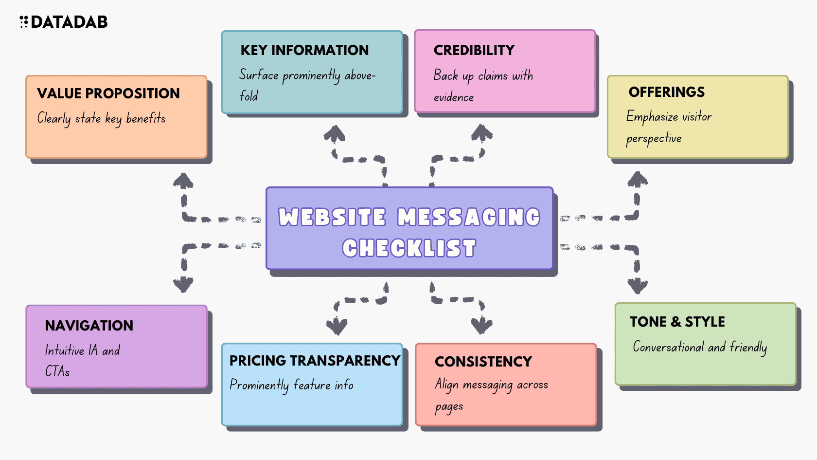
Every page should align core elements like:
- Value proposition: How you uniquely solve visitor/buyer problems
- Offerings overview: High-level capabilities overview
- Target buyer description: Brief text describing ideal customer profile
- Calls-to-action: Links/Buttons to intended visitor paths aligning with buying cycle e.g. secondary pages or contact form
Additionally, the website navigation menu options should remain identical across all sections - nothing confuses more than changing navigation items. While details may expand across pages, ensure consistency on these foundational messaging pillars across the visitor journey.
5. How can you balance self-promotional content while still maintaining visitor-focused messaging?
The 80/20 rule is optimal - devote only 20% of messaging to company achievements, credentials, case studies etc that highlight positive differentiation. The remaining 80% should focus on visitor pain points and how you address them. This balances social proof and credentials to establish authority without going overboard in self-promotion where visitors sense it's more about you than helping them. Guide visitors through the buying journey with messaging centered on easing their struggles. Inserting some proof points reinforces capabilities. But draw attention more to the visitor, keep paragraphs visitor-focused, and explicitly call out the partnership and how you solve issues together.
6. What role does visual media like images and video play in engaging website visitors?
Imagery and video are crucial to breaking up dense text and captivating visitors in an increasingly visual world. Photos/illustrations demonstrating products or services help visitors better understand abstract offerings. Infographics efficiently communicate key statistics and data points. Customer testimonial videos powerfully humanize messaging. Ensure media reinforces written content rather than distracts. Optimize images/video titles and alt text for SEO. Balancing text, graphical and video elements across pages keeps visitors engaged as they move through the buyer journey instead of facing long streams of tiring copy.
7. What tips do you have for writing strong calls to action (CTAs) in website copy?
- Clarity on next steps: Eliminate uncertainty on desired next action e.g. "Get Started Now"
- Sense of urgency: Incentivize action with urgency e.g. "Limited-Time Offer"
- Value communication: Include brief value statement e.g. "See Pricing Plans"
- Contrasting color: Use color that contrasts with background to draw attention
- Prominent positioning: Place CTAs above-the-fold and in-line with key messaging
These CTA best practices compel visitors to click by clearly directing them, communicating additional value from taking action, and prominently positioning the calls to action to capture their attention.
8. What are some tips for simplifying and optimizing website navigation menus?
Concise, organized navigation prevents visitors getting lost while trying to find information. Ideal navigation strikes a balance between simplicity and inclusion. Some tips:
- Lead with 5-7 high-level pages like "Products," "Solutions," "Pricing," "Company"
- Categorize specific secondary pages under dropdown submenus
- Label navigation options using language familiar to visitors - avoid ambiguous terms
- Ensure logical flow moving visitors across buyer journey
- Repeat critical pages like "Contact" in both main and footer navigation
Decluttering navigation while zoning related content reduces confusion. Visitors appreciate menus that intuitively guide them to what they need.
9. How can you gauge if your website messaging effectively engages visitors?
Key metrics signify how visitors respond:
- Bounce rates: High rates turning away from a page signal poor messaging failing to resonate.
- Page views: More page views indicate visitors are engaged to click and explore more content
- Time-on-site: Longer durations signal compelling info keeping visitors.
- Form submissions: More conversions like downloads or contact requests reflect positive engagement.
Conduct A/B tests with re-designed messaging and observe impact on these metrics - lift indicates better quality content and value conveyance from messaging improvements.
10. What singular principle should you keep front and center when optimizing website content?
Visitor-centricity. Messaging that fixates on company achievements may stroke egos but does little to satisfy visitor needs. Laser focus on understanding buyer struggles and crafting everything - page layouts, visuals, calls-to-action, and copy - around addressing frustrations, questions, and desired outcomes best serves visitor experiences and commercial success. Keep asking "So what?" to ensure messaging gets tied back to visitor pains and gains rather than self-congratulatory content that earns buzz but no business.


