"Optimizing your funnel never stops. Continual refinement through data and customer feedback is the key to success."
Offering a free trial is one of the most effective ways to get new users to try your SaaS product. But converting those free trial users into paying customers is an art and a science.
In this comprehensive guide, I'll walk you through the key steps and strategies to optimize your free trial upgrade funnel and maximize conversion rates.
Step 1: Choose the Right Free Trial Model
The first step is deciding which free trial model works best for your business:
Time-Limited Trials
This is the most common approach. Users get access to your full product for a set period, usually 7-14 days. The clock ticking puts pressure on them to experience the value quickly.
Pros:
- Creates urgency to upgrade
- Let's users fully evaluate the product
- Industry standard that users are accustomed to
Cons:
- Can experience dropoff after onboarding
- Need to pace in-app messaging so it's not too aggressive
Usage-Limited Trials
Users get access to all features, but limited to a certain amount of usage. For example, only being able to send 100 emails.
Pros:
- Staggered onboarding since users pace usage
- Allows sampling multiple features
Cons:
- Hard to choose the right usage limits
- Can feel restrictive to users
Freemium
Users get access to a limited feature-set forever. The free version serves as a lead gen tool for the paid product.
Pros:
- Low barrier to signup
- Can build a huge user base
Cons:
- Very few free users convert
- Need separate onboarding flows
For most traditional SaaS products, the time-limited trial is best because it lets users fully evaluate your product while instilling urgency to upgrade.

Step 2: Structure Your Plan Options
Once you've chosen a free trial model, the next step is structuring your pricing plans. Most products offer 3-4 paid plans:
- Basic - Covers core features at low price point
- Pro - Adds more features, integrations, support at mid-range price
- Premium - Includes enterprise features and concierge support
A few best practices on pricing plan structure:
- Price basic plan under $20/mo, pro under $50/mo
- Make basic plan good enough to convert majority of users
- Have fewer feature differences between basic and pro plans
- Position premium plan for large, sophisticated users
Tiered plans give users flexibility to choose the right plan for their needs. Make sure to emphasize the key features and benefits in each plan.
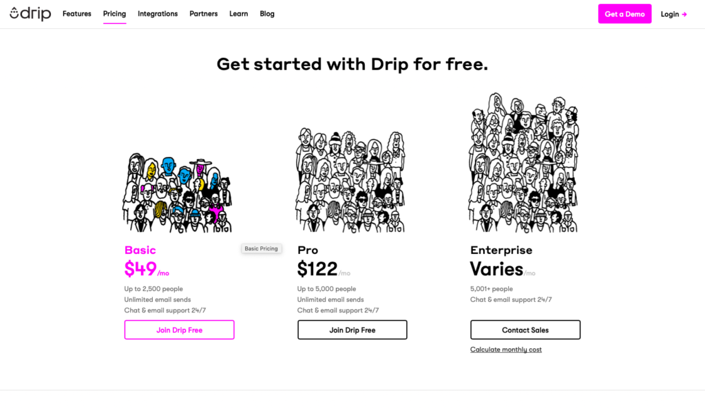
Here's an example SaaS pricing page with 3 paid plans:
| Plan | Key Features | Price |
|---|---|---|
| Basic | Core features, email support | $15/mo |
| Pro | API access, priority support | $39/mo |
| Premium | Single sign-on, custom integrations, dedicated success manager | $99/mo |

Step 3: Structure Your Free Trial Period
Once you've chosen your free trial model and paid plans, you need to architect the actual free trial user experience.
Here are the key components to structure:
Trial Length
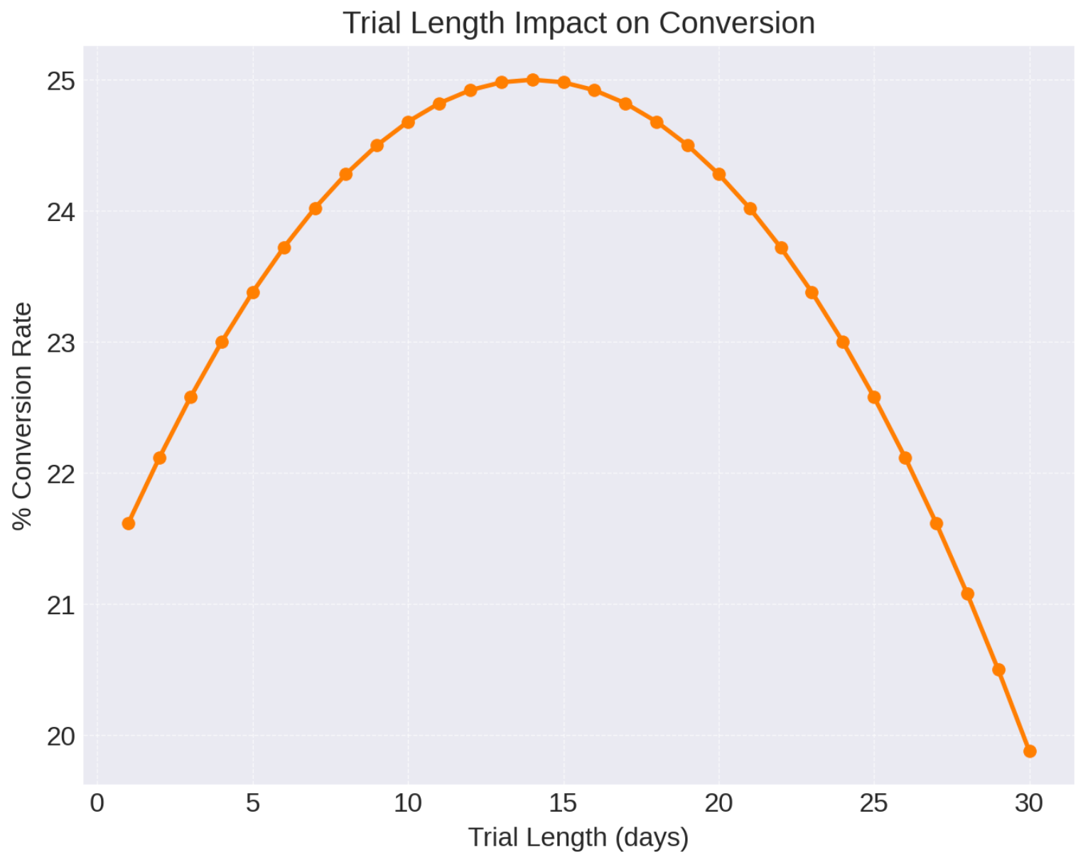
As mentioned earlier, most trials range from 7 to 14 days in length. Anything shorter than 7 days is too short for users to properly evaluate your product. Longer than 14 days results in higher dropoff.
14 days is ideal for complex products that have a longer ramp up and activation cycle. 7 days works for simpler products with faster time-to-value.
Product Access
Users should get access to the full product, no holding features back. The goal is to let them fully experience the value to inform their upgrade decision.
However, you may want to limit access to certain enterprise admin features that could be abused during a trial.
Usage Limits
For products with metered usage like storage, API calls, emails sent, etc - you may want to impose limits during the trial period. This ensures you don't have abusive usage. But don't be overly restrictive.
Account Support
Most free trial users expect some level of live support during their trial. Offer email support and chat support at a minimum. Consider human phone support for products with high ticket sizes.
Success Assist
Proactively reach out to guide users through onboarding. Use in-app messages, emails, and live chat to answer questions and share tutorials. High-touch support converts better.
The goal is crafting a premium trial experience to wow users. Avoid being too restrictive or treating them like second-class citizens compared to paying users.
Step 4: Build Your Upgrade Flow
With the free trial structure defined, let's look at the tactical upgrade flow to transition users to paid plans.
Signup > Onboarding > Activation
The upgrade flow begins the moment a user signs up for a trial. First, they should go through a tailored onboarding flow like an in-app quick start guide.
Next, guide users to hit their first "activation" milestone within the product. This core aha moment will increase likelihood to upgrade.
Time-Based Milestones
At certain milestones in the trial period (e.g. day 3, day 7), use in-app messaging and emails to surface key features/workflows. Guide users through product exploration.
Sprinkle these educational touchpoints throughout the trial to boost engagement.
Scarcity Discounts
Offer time-limited discounts to incentivize users to upgrade before their trial ends. For example:
- 20% off if you upgrade today
- 7 days left to upgrade and save 25%
Scarcity fuels action. But don't offer discounts in every message, or they'll lose impact.
Trial Extension Offers
If a user hasn't upgraded by day 10, they may need more time to evaluate the product. Offer a 7 day extension in exchange for their credit card (but don't charge yet).
This gets users invested while also signaling the trial will eventually end. Extend trials sparingly though.
Persistent CTA
All trial messaging and emails should have clear CTAs to upgrade with matching link/button colors. Remove friction to upgrade.
Many businesses bury the upgrade path. Don't be afraid to prominently market paid plans.
Post-Trial Downgrade
If the trial ends and a user still hasn't upgraded, they'll lose access to the product. You can choose to downgrade them to a free plan if available.
Clearly communicate the downgrade policies and urgently nudge users to upgrade beforehand.
Step 5: Make Your Post Purchase Experience Amazing
Congrats, your prospect has now upgraded! But the journey isn't over.
Focus on delivering an incredible post purchase experience. This builds loyalty and retention for the long-term.
Welcome Emails
Send a warm welcome email when a user upgrades, thanking them for their purchase. Share links to onboarding resources to re-engage them.
Continuous Education
Keep nurturing and educating upgraded users with in-app tips, training materials, live classes, etc. Especially for sophisticated products.
Impressive Support
Invest in white-glove support and services for upgraded users. Assign them success managers, offer faster response times, and go above-and-beyond.
Proactive Upsells
Once users find success on their initial plan, proactively surface the benefits of upgrading to the next plan. Upgrade pathing is powerful.
Loyalty Discounts
Offer loyal long-term users periodic discounts, credits, and perks. Look at their tenure, payment history, engagement, etc. and reward them.
Rolling out the red carpet for upgraded users ensures they renew and become brand evangelists.
Key Free Trial Optimization Metrics
Here are the key metrics to track to optimize your entire free trial funnel:
- Trial start rate - % of visitors who start a free trial
- Activation rate - % of trials who hit your product's core aha moment
- Upgrade rate - % of trials who convert into paid accounts
- Time to convert - Average time for trial users to upgrade
- Trial extension rate - % of users who take an extension offer
- Downgrade rate - % of trials that expire without upgrading
Analyze these metrics to find leakages in your funnel and continually test improvements. For example:
- Low start rate - Improve signup form design or trial marketing copy
- Low activation - Revamp your onboarding flows and in-app messaging
- Low upgrade rates - Test pricing page variations, offer more scarcity discounts
- High extension rates - Shorten your trial period
- High downgrade rates - Be more persistent with upgrade nudges as trial nears end
Conclusion
Optimizing your free trial funnel takes continual testing and improvement. Start by structuring a compelling trial offer and upgrade path. Monitor funnel metrics to uncover opportunities.
Over time, you'll be able to convert more free trial users into long-term profitable customers. Just don't neglect the post purchase experience once they upgrade!
Hopefully this guide provided an in-depth look into designing and optimizing high converting free trial funnels. Let me know in the comments if you have any other tips!
FAQ
1. What is the ideal free trial length?
The ideal free trial length is typically 14 days. This gives users enough time to properly evaluate your product, without the trial dragging on too long. 14 days also creates a sense of urgency through the limited timeframe. For simpler products, you may only need 7 days. For more complex enterprise products, consider 21-30 day trials. But 14 days is the sweet spot for most SaaS.
2. Should my free trial include account limits or restrictions?
In general, your free trial should provide full access without major restrictions. You want users to experience the full value of your product in a real-world setting. However, for products with heavy usage like email, storage, or API calls, you may need to impose reasonable limits to prevent abusive usage during trials. But don't overly restrict the user experience.
3. When should I offer discount promotions?
Discount promotions can be very effective at converting free trial users. Some good times to offer discounts are:
- Right before the free trial ends
- If the user hasn't upgraded by day 10 of a 14-day trial
- To incentivize annual vs monthly subscriptions
- To existing customers as loyalty promotions
Just don’t offer discounts non-stop or they’ll lose their novelty and appeal. Target key moments in the onboarding journey.
4. How do I get users to activate during the trial?
Getting users to hit their initial "activation" milestone during the trial is critical for upgrading. This activation event is the aha! moment where a user first experiences your product's core value. Guide trial users to this moment through in-app messaging, email campaigns, live chat support, and user onboarding flows. Make it obvious what your activation event is.
5. Should I offer a free plan?
The pros of offering a free plan or freemium option are that it lowers barriers to signup and you can build a large user base. The cons are that conversion rates to paid plans are typically very low. Most businesses are better served by offering a free trial instead of a perpetual free plan. You can always downgrade non-converting trial users to a basic free plan later if you'd like.
6. How do I get insight into why users are not upgrading?
The best way to understand why users aren't upgrading is to simply ask them through surveys and exit interviews. Reach out to users that did not convert and ask why. Common reasons are price too high, didn't see enough value, still evaluating, didn't have budget yet. Follow up questions can uncover more qualitative insights.
7. What makes for a successful post-purchase experience?
The key to successful post-purchase is to wow the customer after they pay. Offer white-glove onboarding, assign them a dedicated success manager, monitor their usage and proactively offer help, give them access to live training and community events, and surprise them with loyalty perks and discounts. Make them feel like a true VIP.
8. How do I motivate sales team to sell trials vs just downloads?
To motivate sales to prioritize trials over pure product demos/downloads, institute a commission/bonus structure that rewards trial starts. You can pay a bonus for every net new trial start. Track trial start rates by rep. Gamify trial starts with leaderboards and SPIFFs. Compensate on key trial funnel metrics rather than just closed revenue.
9. What trial funnel metrics should I focus on optimizing first?
The two most important metrics to focus on are trial start rate and trial conversion rate. If you can improve how many visitors start trials and how many trials convert, you'll see big gains. First optimize for getting more people into trials through website copy, demo design, and sales outreach. Then improve conversion rates through better onboarding and in-app messaging.
10. How much trial conversion rate lift is considered good?
Good trial conversion benchmark rates are:
- Trial start rate: 20-40%
- Activation rate: 50-80%
- Upgrade rate: 15-35%
If you can lift trial start rates by 10% and lift conversion rates by 5%, that is considered significant improvement. Getting trial start rates above 30% and upgrade rates above 20% indicates a well-optimized funnel.


