

Most competitive comparison landing pages are pretty bad. They sound like overly promotional, aggressively biased, and just a little desperate. Your competitor probably has one too, and you can bet it's no better.
But it doesn't have to be this way. When done right, a compelling competitive comparison page can be an incredibly powerful weapon in your marketing arsenal. It can turn uncertain prospects leaning towards a rival into loyal customers. The question is, how do you get there?
I run a SaaS marketing agency, so I've seen my fair share of competitor pages (and made a few myself). Over time, I've noticed certain patterns among those that work, and those that flop. In this post, I'll share strategies, tactics, and the psychology behind what goes into an effective competitive comparison landing page.

The Subtle Art of “Positioning”
Before we dig into design, let's get this straight: your competitive comparison page is more about positioning than it is about honest comparisons. What's the difference?
- Comparison: Listing the objective differences between products
- Positioning: Shaping how those differences are perceived to give your product the edge.
People make purchasing decisions based on emotion, then justify them with logic. Your job is to play into that emotion. A good competitive comparison page doesn't tell a prospect why you're the ideal choice; it makes them feel it.
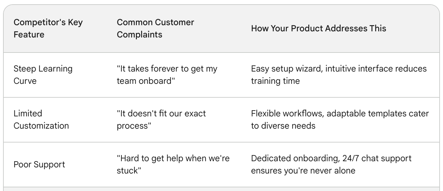
Let's unpack a real-world example. Imagine you're selling a project management tool. A key competitor is super flexible and customizable but has a steeper learning curve. You could present that as:
| Feature | Our Tool | Competitor |
|---|---|---|
| Customization | Moderate | Extensive |
That's a comparison. But how about this positioning-focused reframing:
| Feature | Our Tool | Competitor |
|---|---|---|
| Ease of Getting Started | Get up and running in hours | Requires days of setup and configuration |
Same information, very different spins. Your tool is framed as the quick, efficient solution. The competitor comes across as a time-sink, implicitly positioned as better suited to large teams with complex workflows and the time to dedicate to elaborate setups.

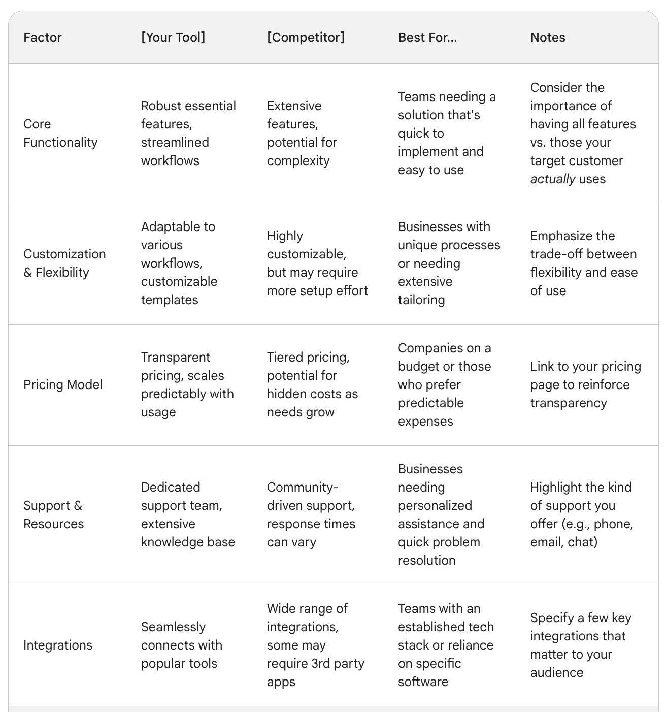
Mastering the Comparison Table
The centerpiece of most competitive comparison pages is the comparison table. This is where you get granular. But, it's easy to mess up. Here's how to nail it:
Choose Your Battles
You can't compare everything. Select 5-8 differentiating features that are both important to your ideal customer and where you have a genuine advantage. If you try to show superiority across the board, you'll lose credibility.
Language Matters
Don't just drop feature names in the table. Phrase them to subtly highlight your strengths. Instead of “Integrations”, try “Plays well with your existing tools.” Instead of “Reports”, use “Make data-driven decisions with advanced analytics.”
Checkmarks are Tricky
A green checkmark next to your product looks great, but those red Xs by your competitor's name can backfire if they offer the feature with some limitations. Opt for carefully worded descriptions instead:
| Feature | Our Tool | Competitor |
|---|---|---|
| Team Collaboration | Unlimited team members & guest roles | Up to 5 team members on the free plan |
Framing Beyond the Table
Your comparison table gives the hard facts, but you need more to seal the deal. Here are the key elements that turn a good comparison page into a conversion machine.
The Pain-Point Punch
Open your page with a short, sharp headline and subheading directly addressing the biggest pain points your competitor's customers have. This taps into existing dissatisfaction, making them receptive to your solution.
Social Proof with a Twist
Testimonials and logos are standard, but get strategic. Choose ones highlighting features you outshine your competitor on, or even better, include testimonials from people who switched from your competitor to you.
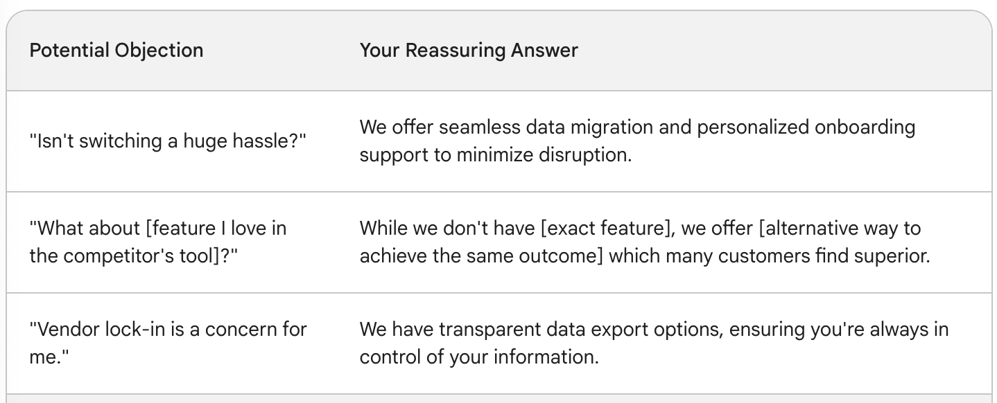
Handle Objections Head-On
Prospects have anxieties. “What about [feature I might miss]?” “Won't switching be a nightmare?” Disarm these worries with an FAQ section that acknowledges potential objections and provides reassuring answers.
The Psychology of “Not Picking”
People are surprisingly averse to making direct negative judgments. Your prospect feels icky actively thinking, “This competitor is bad.” But what if you could make them convert without that mental hurdle?
Here's a subtle strategy: instead of a “Us vs. Them” page, create a “Should I pick X or Y?” page. Position yourself as a neutral advisor. Break down the pros and cons of both options in an almost fair way. Naturally, tilt the scales, so your product comes out looking like the obvious choice for most use cases.
This approach does two things – it builds trust because you're seemingly objective, and it relieves the prospect of having to explicitly judge your competition.
The Art of the “Non-Comparison” Comparison Page
Want to get really sophisticated? Consider scrapping the head-to-head comparison entirely. Here's how it might work:
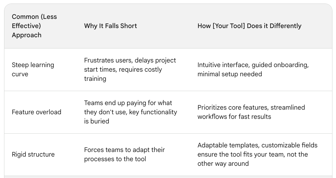
The Problem-First Approach
Instead of competitor names, your page focuses on a common problem. Your solution is presented, followed by a cleverly worded section like, “Other tools try to solve this by [common, less effective approach your competitor uses]. But here's a better way…”
The Ideal Buyer Approach
Create a landing page titled something like “Is [your tool] right for you?”. Discuss use cases, target businesses, and common needs your tool excels at. This subtly implies that other tools are better suited to different needs, subtly disqualifying them without outright negativity.
A competitive comparison page, at its best, is an extension of your overall product positioning. Think deeply about the kind of customer your competitor appeals to, and then design your page to become the perfect haven for the ones who don't fit that mold.
Finally, remember that the sales battle isn't won exclusively on this page. An effective comparison landing page is a powerful tool, but it works best as part of a larger marketing ecosystem that continuously nurtures and educates potential buyers.
Let me know what strategies you've found effective on competitive comparison landing pages – I'm always learning!
FAQ
1. My product is similar to my competitor's in many ways. How do I create a compelling comparison page?
Focus on the subtle but crucial differences. Dig into customer pain points with your competitor's product – are there common complaints about setup time, support, or perhaps limitations in specific use cases? Highlight where your product provides a smoother, more tailored experience, and frame those differences in terms of benefits to the user.
2. I'm worried about coming across as too aggressive towards my competitor. How do I create an effective comparison without being negative?
Focus on positioning your product as the clear solution to a problem, rather than directly tearing down the competitor. Use language that highlights your strengths without explicitly using negative terms about the alternative. Testimonials from customers who switched to you are powerful, especially if they cite issues they had with your competitor and now find resolved.
3. Should I use my competitor's name and logo on my comparison page?
This requires careful consideration. Including a competitor's branding can boost your credibility as it shows you're not afraid of comparison. However, it can also backfire by giving them unnecessary visibility on your site. Consider a “Should I choose X or Y?” framing where the competitor is referred to indirectly. Alternatively, focus on common issues faced by those using “tools like theirs”.
4. What's the best way to structure my comparison page?
While your comparison table is the centerpiece, don't neglect the surrounding content. Open with a strong headline and subheading directly addressing your ideal customer's frustrations. Use testimonials that validate your competitive strengths. Have a dedicated section to proactively address common objections and anxieties a potential switcher might have.
5. How many features should I include in my comparison table?
Quality over quantity is key here. Avoid overwhelming prospects with a laundry list of every difference. Select 5–8 features that are both genuinely important to your target customer and where you clearly have an advantage. Remember, the goal is to guide a decision, not offer an exhaustive technical specification sheet.
6. What if my competitor offers a feature I don't?
Be honest but strategic. Avoid highlighting your weaknesses. Instead, consider if there's an alternative way you achieve a similar outcome for the customer. You might also consider if that feature is truly a must-have for your ideal customer, or perhaps appeals to a slightly different user profile than the one you're targeting.
7. I'm a SaaS startup with limited resources. Can I still create a great competitive comparison page?
Absolutely! Focus on clarity and strategic positioning. A simple, well-designed page that highlights a few key differences can be even more impactful than a cluttered one trying to compare everything. Leverage free testimonials, or even offer a small incentive (e.g., a discount) to early switchers in exchange for their feedback.
8. Should I focus my comparison page on one main competitor or several?
Generally, it's wiser to focus on one key competitor at a time. This allows for a more targeted message. However, if there are many similar players in your space, you could consider a “problem-first” approach where you focus on the common issue in the industry or a “Should I choose X or Y” framing.
9. How often should I update my competitive comparison page?
Regular review is important. If your competitor releases a major new feature or a significant price change, it might warrant updating your page. Aim to revisit it at least quarterly, even if no major alterations are required.
10. Are there any ethical considerations with competitive comparison pages?
Definitely. Be truthful and avoid misleading claims. While positioning is key, outright lies will backfire, damaging your brand's reputation. Focus on highlighting genuine strengths and let the customer draw their own conclusions.